App store screenshots that make the product understandable
A useful screenshot is not a poster placed over an arbitrary interface. It shows a real task, the decisive product moment and a message that reads immediately on a small screen.
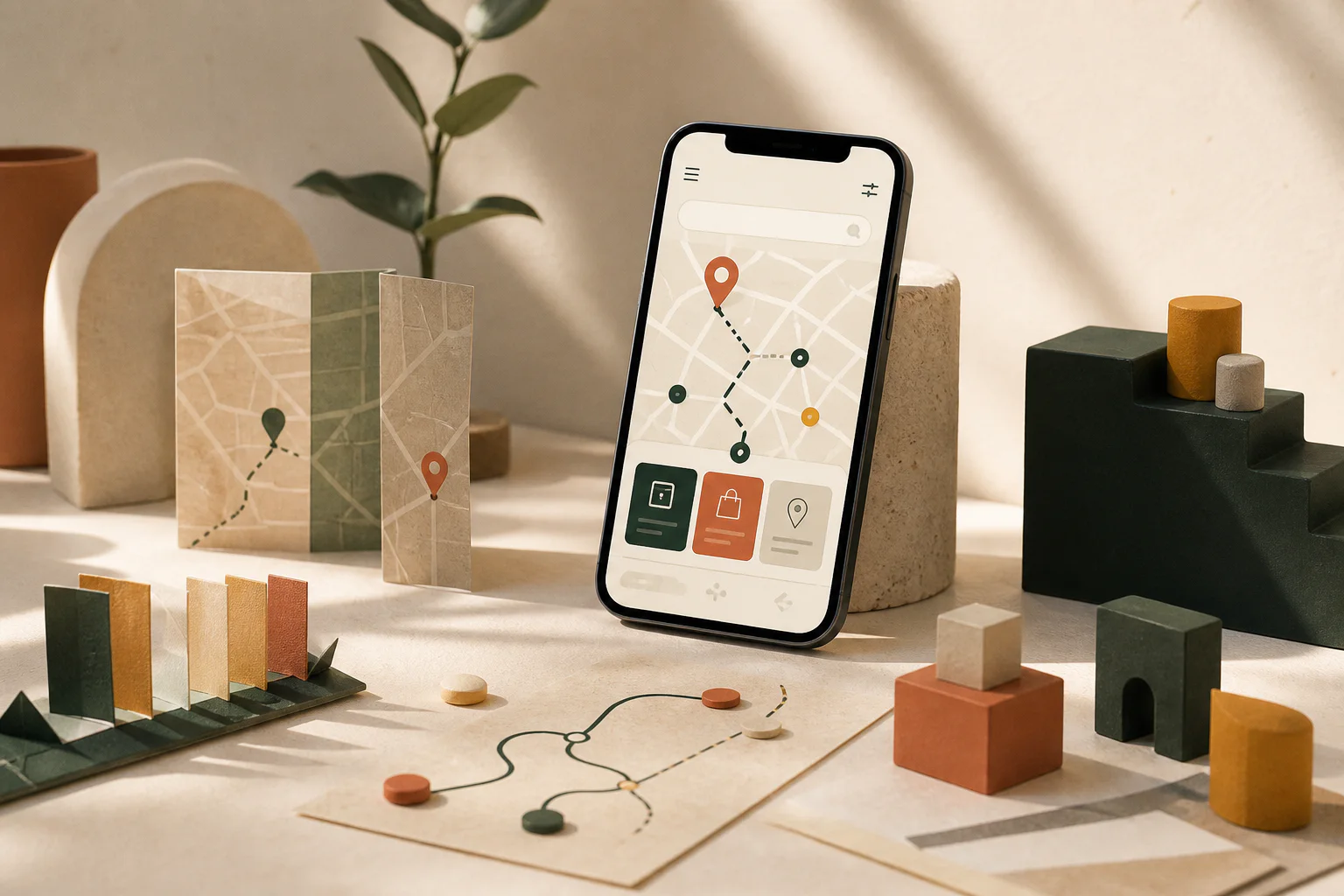
People may see only a few assets in search. The opening images must explain what the app does, who it serves and which action it makes easier. Decoration cannot replace that proof.
Apple recommends a single clear visual idea and notes that screenshots can appear in search results. Google Play supports localized graphics and experiments. Sequence, subject and language therefore belong in one plan.
Lead with the most important task
The first asset should not show a menu or sign-in screen. It should show the moment that makes the app worth installing: a relevant listing in a marketplace, a clear lesson in a learning product, or the completed result in a utility.
Copy above or beside the interface stays short. It names the outcome and context instead of listing five features.
Show the real interface
Screenshots need to match the current release. Old navigation, invented data or a feature that exists only on a roadmap undermines trust and may create review problems.
We build the sequence from real states: starting point, core action, useful detail and outcome. Personal information is replaced with controlled demo data rather than blurred as an afterthought.
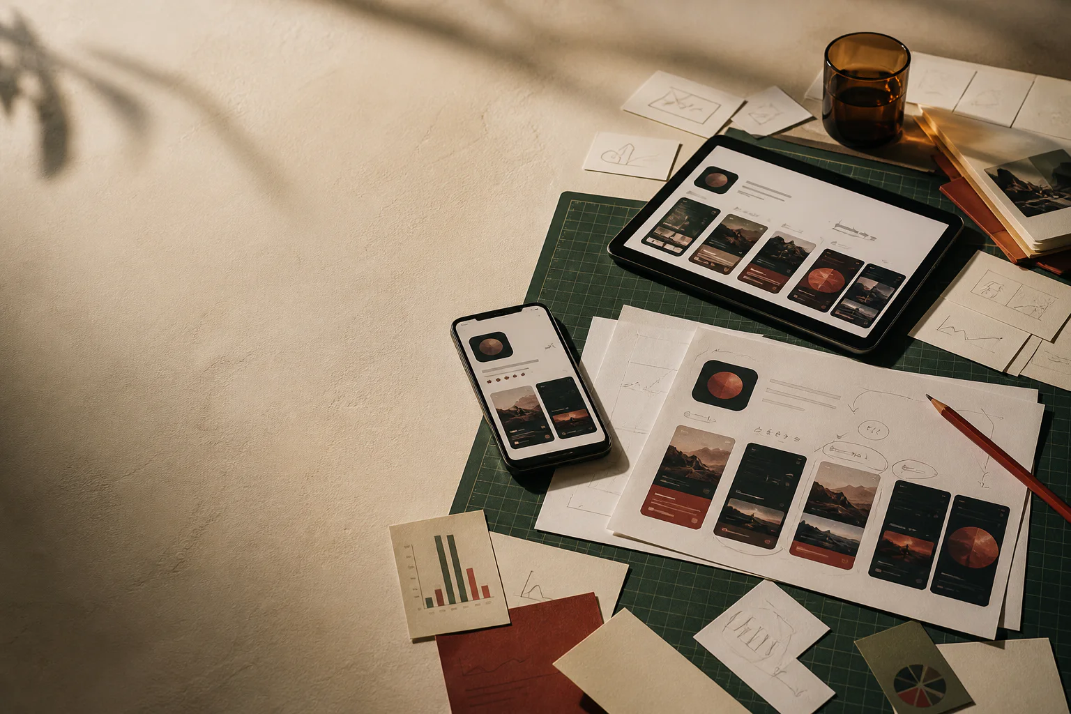
The first asset should not show a menu or sign-in screen. It should show the moment that makes the app worth installing: a relevant listing in a marketplace, a clear lesson in a learning product, or the completed result in a utility.
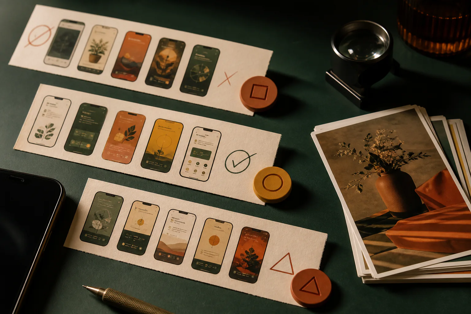
Screenshots need to match the current release. Old navigation, invented data or a feature that exists only on a roadmap undermines trust and may create review problems.
Check legibility on a device
An asset that works on a large design monitor may be unreadable in the store. Text size, contrast, safe areas and visible interface are reviewed at actual preview scale. Device frames must not cut through content.
Layouts are reset for each required format. A desktop crop inside a phone shape is not mobile design.
Localize and test
Localization includes wording, examples, sequence and sometimes the subject itself. A translated headline over an unchanged foreign-language interface looks unfinished.
Tests need a clear hypothesis. Changing image, copy and sequence at the same time makes the result hard to interpret. A useful backlog starts with the largest understandable uncertainty.
Screenshot review before upload
This pass catches the most common production mistakes.
- Opening assets explain the core value and audience
- Every visible interface belongs to the current app
- No real personal data appears in the creative
- Copy remains readable at store preview size
- All supported device formats have been checked
- Localized copy and imagery belong together
- Each experiment has one documented hypothesis
The image must keep the promise made by the copy
Steingraf Labs connects screenshot direction, the real product interface and store experiments. The result is a traceable product story rather than a glossy mockup.
View the related serviceReviewed primary sources
Platform rules change. Each guide therefore links to the official material behind its technical statements.